皿富器食唸起來就是「名副其實」,這句成語的意指名聲或名稱與實際相符合。
我們的期待著器皿裝成豐富美味的食物,讓上門顧客吃美食時,有著最原始的期待。
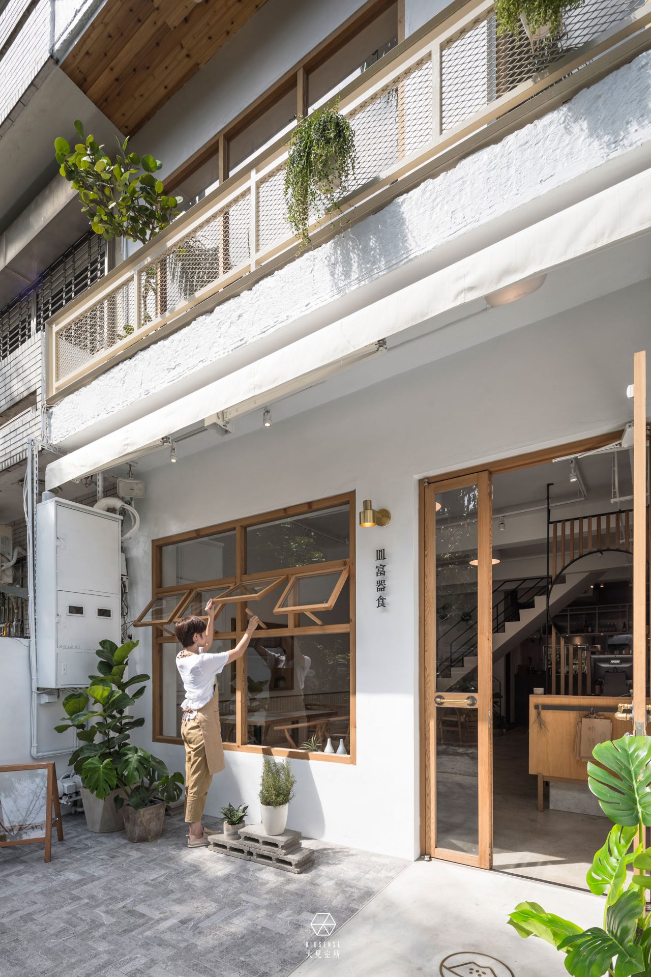
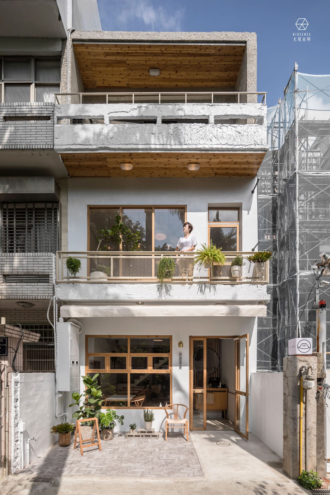
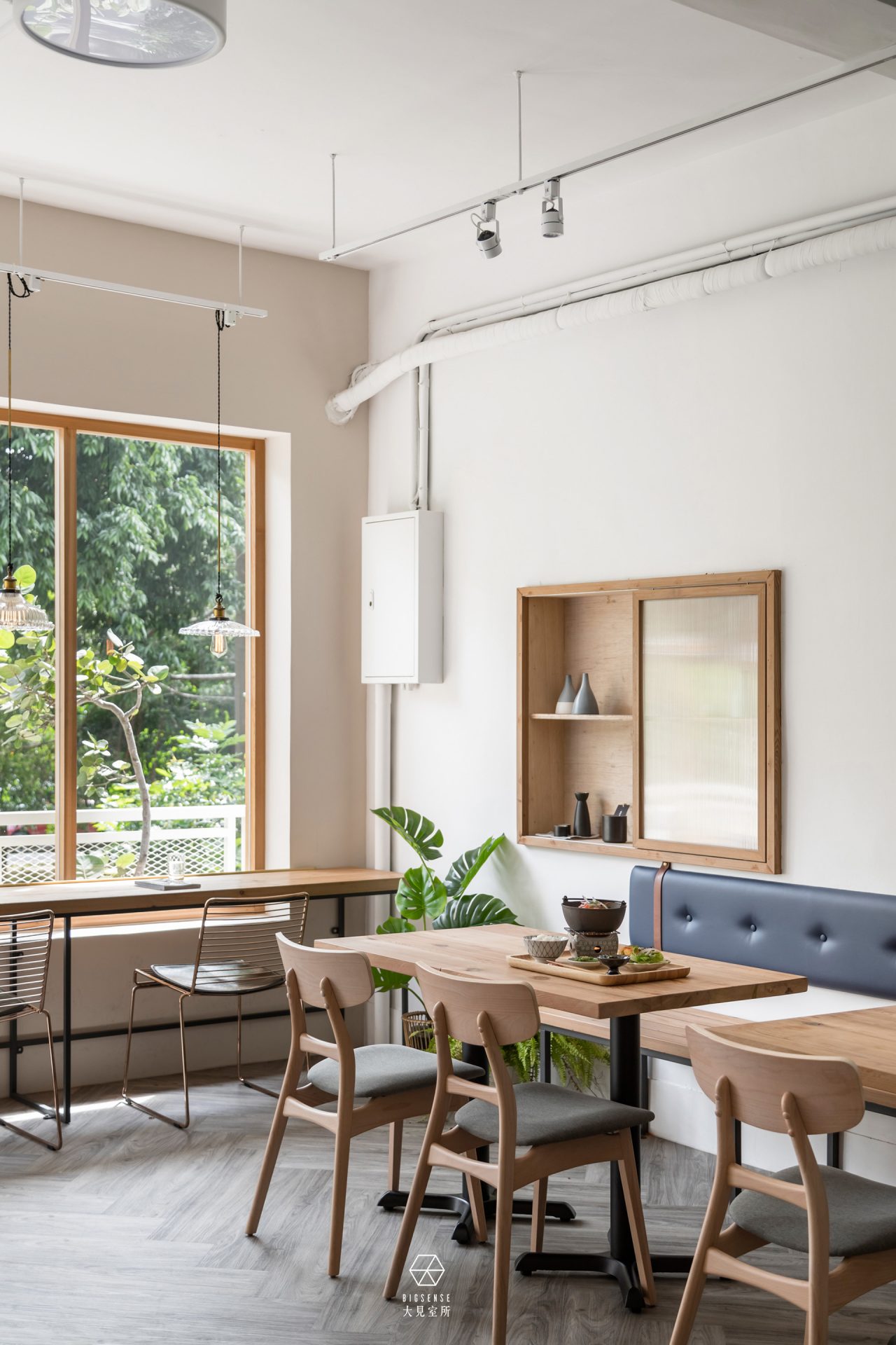
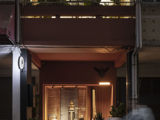
空間本質我們以質樸的材質呈現,在外觀選擇以實木窗框傳遞溫潤手作感,白色是巷弄間最舒服的顏色。
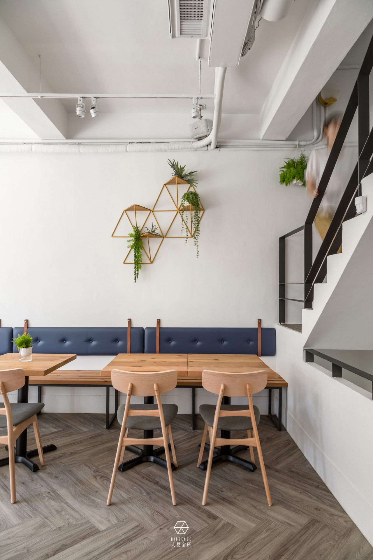
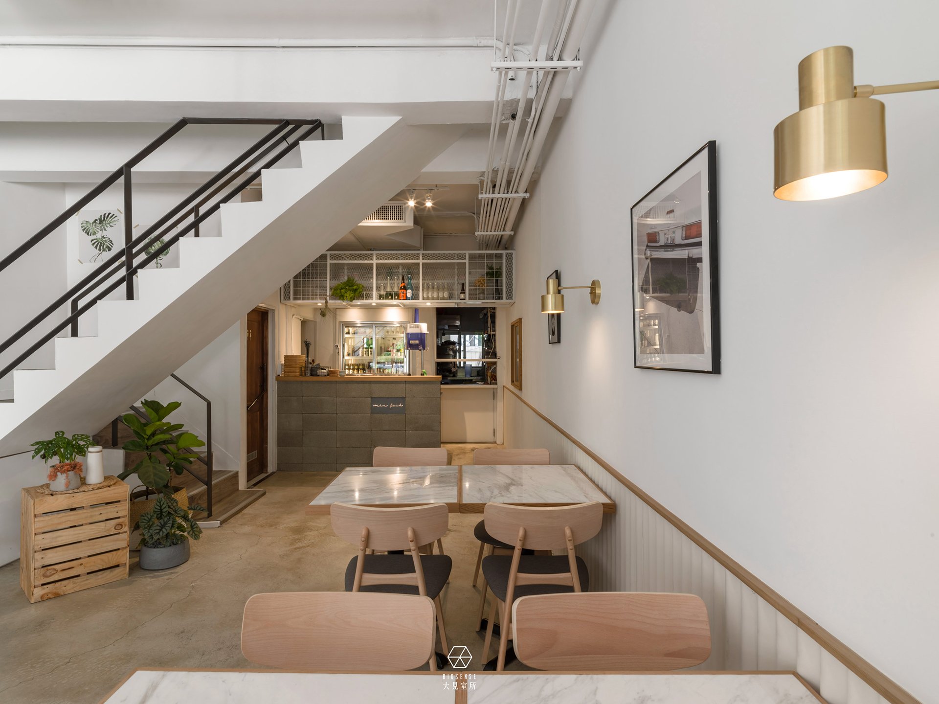
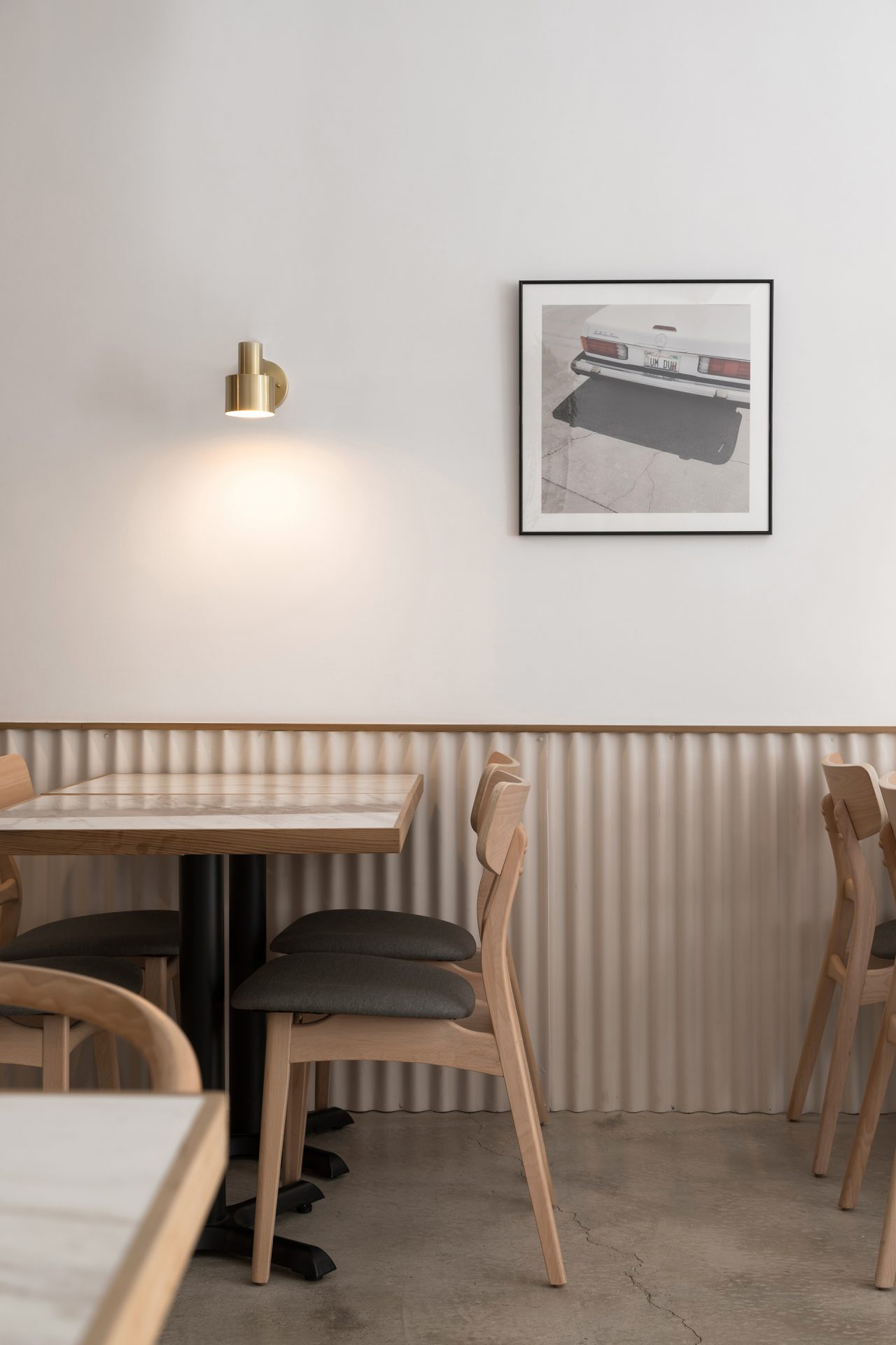
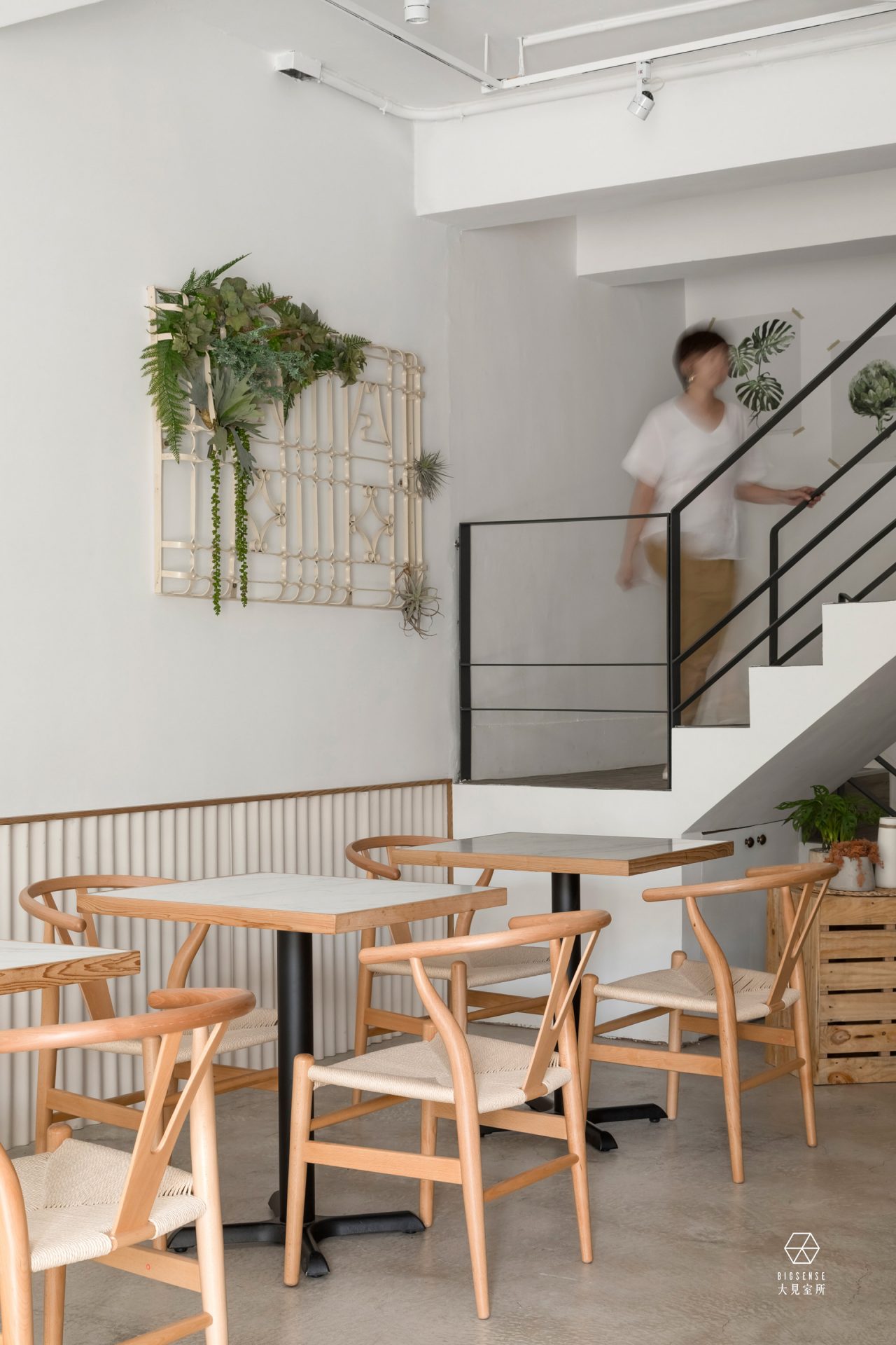
入口地坪嵌入黃銅字logo作為第一印象,進入室內後,灰色粉光地坪做為背景,藕色浪板和純淨白牆相互襯托,
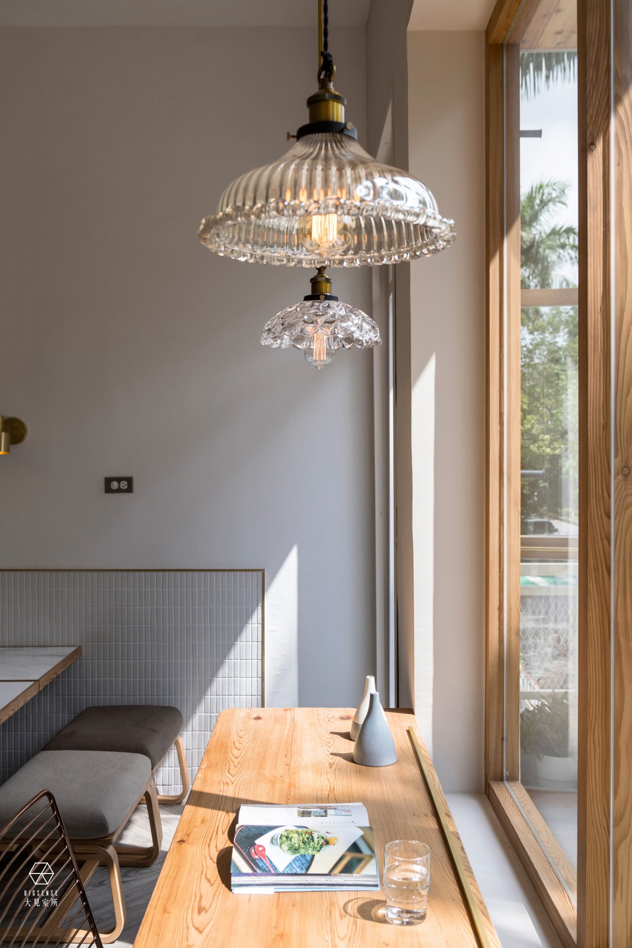
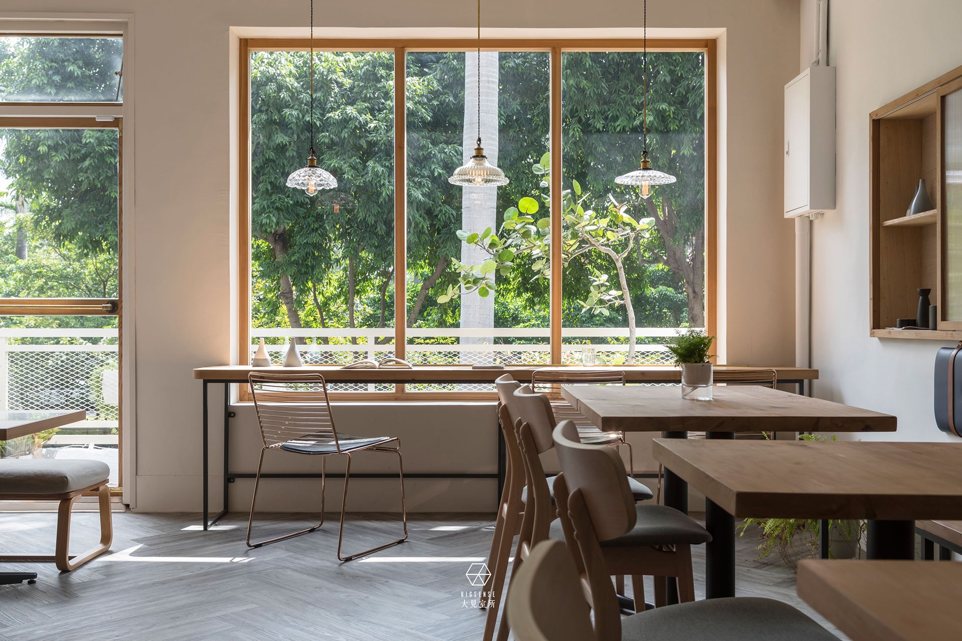
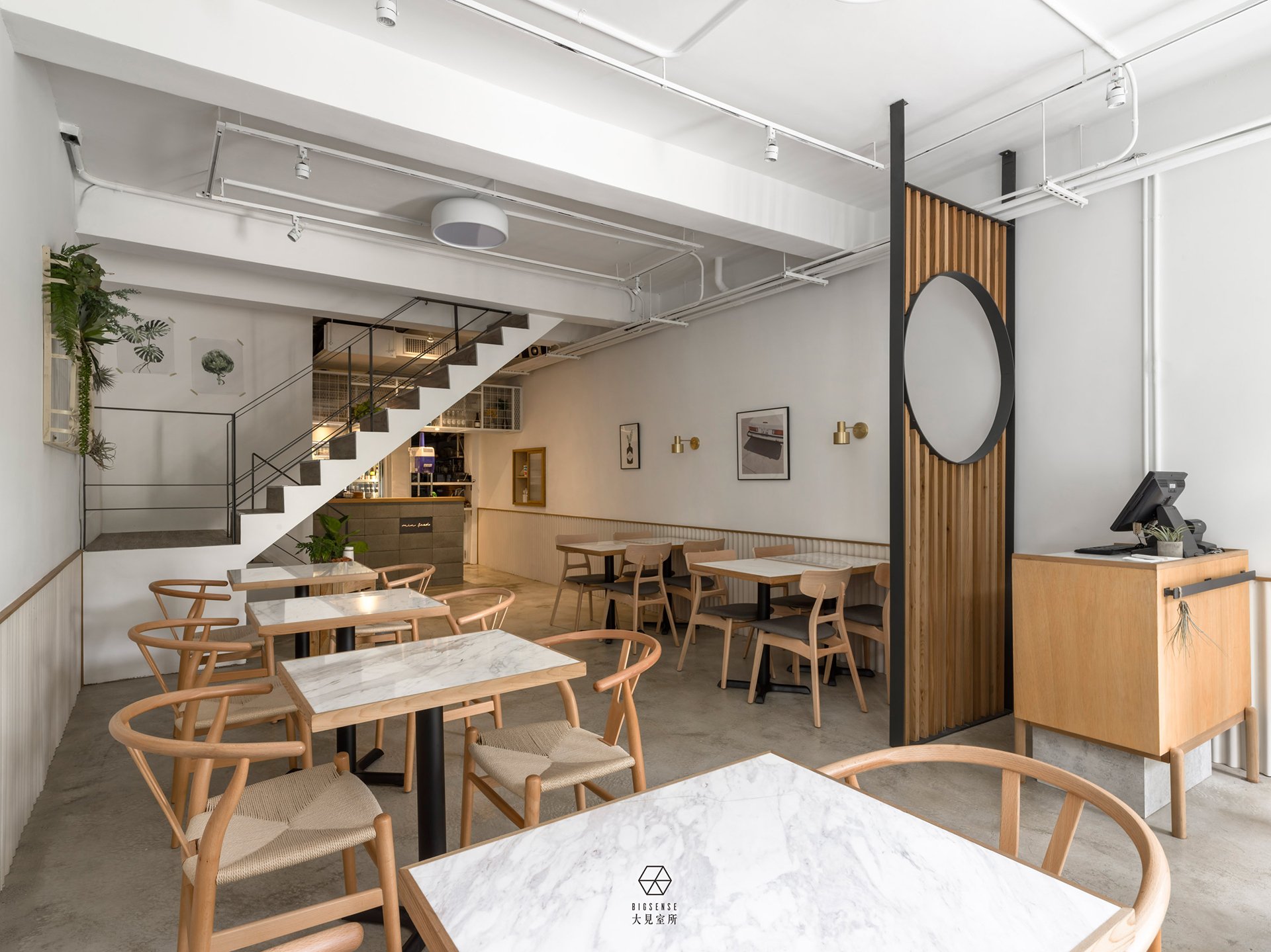
細細品味銀狐大理石桌面和山毛櫸傢俱完美呈現,構築午後悠閒生活的分鏡。
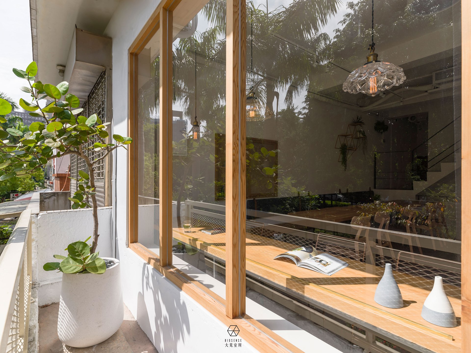
今天不讓咖啡因佔據焦慮,改吃輕口味的日式料理是健康的,我們將清新的日系風格傳遞給每一位顧客。
“Min Food” named after a Chinese idiom “genuine”, and the meaning of this idiom means that the fame or name matches its true self.
Our owner expects to fulfill the utensils with delicious and hearty food, to meet the expectation of customers coming over for meals.
The essence of space is presented with plain materials. In the appearance, the solid wood window frame express warmth and handy feeling. White color brings the most comfortable atmosphere among the lanes.
Logo on the entrance floor is embedded with the brass carving as the first impression while entering the space. Stepping into the room, you will see the matte gray floor in the background, the pale pinkish corrugated polycarbonate board and pure white wall brings out its refined taste. The pale marble table and the beech furniture are perfectly pictured a leisure lifestyle.
Nowadays, we wouldn’t bring in anxious feeling of caffeine. We bring out the fresh Japanese style to our customer with healthy and light-tasting Japanese cuisine.